
People undervalue the role that art plays in their everyday lives.
In the past year, I have taken two international trips: one to Japan and one to Mexico.
When traveling internationally, often the signs are in the primary language of the country where the airport is located, and sometimes, there are signs in English.
For the languages that are not immediately present, there is iconography for the signs to direct travelers to their destination.
Although I experienced this at the airport, and generally experience an English-speaking world, iconography like this is everywhere, and it is one of the ways that art plays an essential role in universal communication. Japan designed a set of icons in the 1964 Tokyo Olympics to accomplish the task of representing an image for each sport so that athletes and viewers of any language could understand which sport was under focus. Japanese designer Masaaki Hiromura completed an updated set of designs for the sport icons for the 2020 Tokyo Olympics (Source: https://www.theolympicdesign.com/olympic-games/pictograms/tokyo-2020/).
The same applies to more everyday occurrences, such as gendered restrooms when going out to eat.
Trendy restaurants sometimes use deviations from the human vs. human with dress icons to denote men's and women's restrooms, such as leaving an initial for M and W, by using other words such as Ladies and Gentlemen, or by using other images.
I encountered this during my trip to Mexico going to a restaurant and being faced with restroom doors labeled M (for mujeres) and H (for hombres).
Even when initials are used on doors on English, I still have to think for a second to confirm that it's the correct door, as it's not as instinctive as seeing universal icons that I register immediately.
Think of the classic yellow smiley face that has evolved today into an extensive set of emojis; at one point that was a new design that communicated good will to anyone who saw it.
(See https://www.cnn.com/style/article/artsy-smiley-face-origin/index.html for more information about the yellow smiley face.)
Icons are certainly a subset of art, and they may not be what you picture in a museum, but they are designed by artists with a concern for the experience of the user so that they have to think as little as possible while viewing them to get to the meaning. Essentially like words. You could think of more realistic artwork, such as paintings, kind of like the novel version of the universal language, in which there are layers that you unpack when viewing the painting as a whole to get a more elaborate meaning and story.


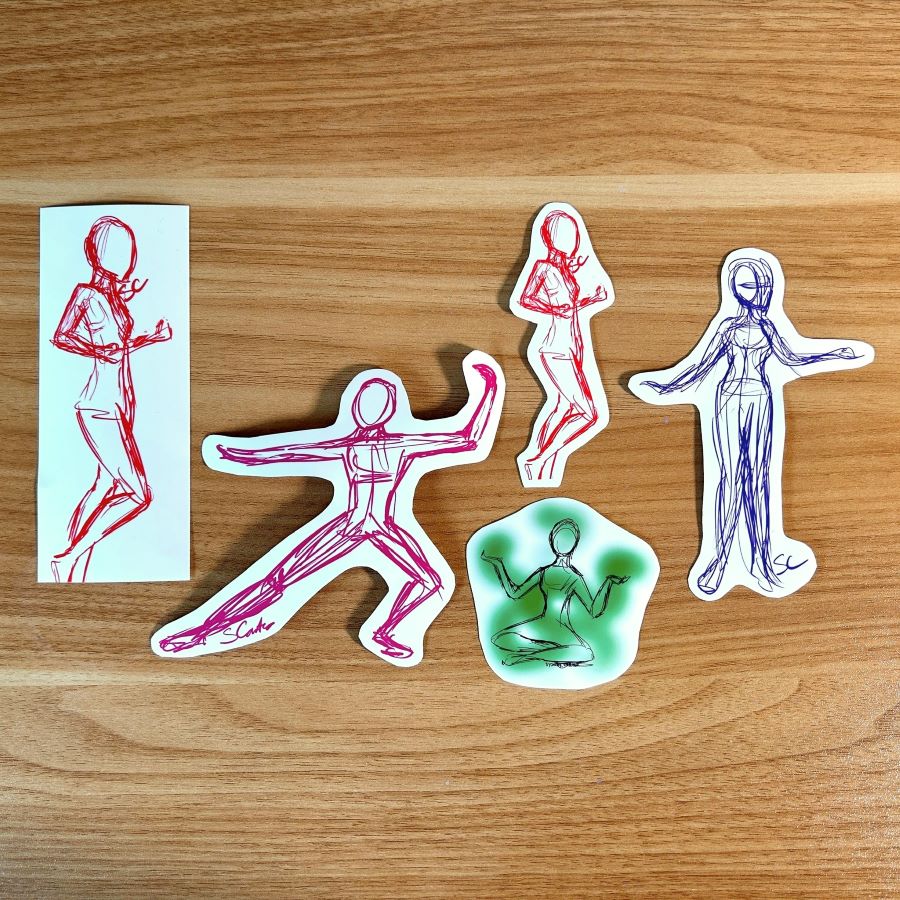
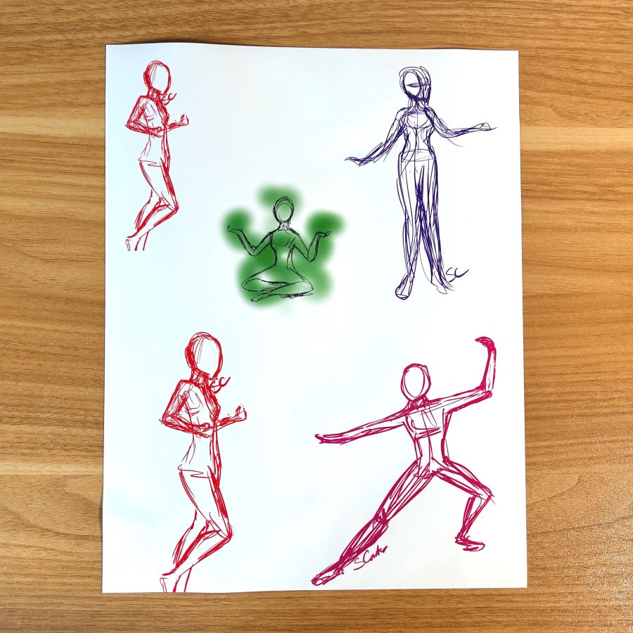
I've been wanting to do more scalable products with drawings that I've done before. As I dip my toes into expanding my product line in addition to custom character drawings, I bought some waterproof sticker vinyl paper and decided to print some of my drawings on them. I printed some of the Soul Figure drawings that were basically an art therapy for me during isolation in 2020. I also like these because I find them kind of motivational and validating, characteristics that I think a lot of people look for in stickers that they place on objects that they frequently use like water bottles or laptops. The Red Jogger Soul Figure is probably my favorite because of the rich, grounded red color and the push forward as it captures a jog mid-stride. I printed the Soul Figures on sheets of sticker vinyl and then cut them out using an X-acto knife and scissors. When I shared with friends, the shapes following the contours of the figure were more popular than block rectangular stickers. It was kind of fun to make the stickers, and I think I'll make more of them soon!